The optimal image size for Facebook ads in 2026 is 1440 x 1800 pixels for Feed and 1080 x 1920 pixels for Stories and Reels. Use 4:5 for Feed, 9:16 for full-screen placements, and 1:1 when placement reuse matters more than mobile screen coverage.
The popular advice to export one 1200 x 628 image and let Meta resize it everywhere is incomplete. A horizontal canvas leaves far more unused mobile space than a vertical Feed asset, so your hook, product and offer compete with the interface before the buyer has even processed the ad. Image sizing isn’t a design afterthought. It changes what the media buyer is buying.
Why the universal image size for Facebook ads is dead
A single master image is a media buying compromise disguised as a production shortcut. For Feed, start with 1440 x 1800 pixels at 4:5. Build a separate 1080 x 1920 pixel 9:16 asset for Stories and Reels. Meta’s current Feed guidance supports 1:1 and 4:5, and lists 1440 x 1800 pixels for the 4:5 format. (Meta’s current Feed image specifications)
The old 1200 x 628 export remains associated with an earlier horizontal-first workflow. A 1200 x 628 canvas may upload successfully, yet it gives mobile Feed less vertical territory than 4:5. Resizing also cannot rebuild the composition around a product, offer, or headline. The result is often an ad that technically fits while asking the viewer to process a smaller, less prominent message.
Media buying rule: Judge the file by the visual territory it earns before the thumb moves, not only by whether Meta accepts the upload.
Aspect ratio tolerance creates a hidden performance cost. Automated placement can resize an asset, but it cannot decide whether the logo may be cropped, whether the price sits too close to an edge, or whether a product hand must remain visible. The expensive failure is not always a rejected upload. It is an approved ad that spends normally while showing a weaker first frame.
Strict export templates prevent that waste. Treat each ratio as its own media asset: a 4:5 Feed creative, a square carousel card, and a 9:16 Story should share the concept, not necessarily the canvas. Our 2026 AI ad creative workflow applies the same separation, keeping concept testing distinct from placement production.
What are the exact pixel dimensions for every Meta placement
Exact dimensions matter because aspect-ratio tolerance can reduce the space your message earns. Use 1440 x 1800 pixels for Facebook Feed single-image ads, then build separate files when the composition changes materially. Meta also lists a 1080 x 1080 pixel baseline for 1:1 assets, a 600 pixel minimum width for many image formats, and a 30 MB maximum file size. (Meta’s image ad guide)
An aspect ratio is a width-to-height relationship that determines how an image fits a placement. A 1080 x 1350 file is 4:5, 1600 x 1600 is 1:1, and 1600 x 900 is 16:9. (Meta’s aspect-ratio guidance)
Use this table as a production reference, then verify the inventory selected in Ads Manager. Placement rules vary, and a file that uploads can still crop a headline, logo, price, or product detail.
Meta Placement Dimensions 2026
| Placement | Aspect ratio | Recommended pixels | Minimum width |
|---|---|---|---|
| Facebook Feed single image | 4:5 | 1440 x 1800 | 600 pixels |
| Facebook Feed square asset | 1:1 | 1080 x 1080 | 600 pixels |
| Instagram Feed square asset | 1:1 | 1080 x 1080 | 600 pixels |
| Stories | 9:16 | 1080 x 1920 | 500 pixels |
| Reels | 9:16 | 1080 x 1920 | 600 pixels |
| Marketplace | 1:1 | 1080 x 1080 | 600 pixels |
| Facebook right column | 1:1 | 1200 x 1200 | 600 pixels |
| Carousel card | 1:1 | 1080 x 1080 | 600 pixels |
The right column needs a simple composition. Meta lists 1200 x 1200 pixels, but the asset appears in a much smaller desktop unit. Use a product or face that remains legible after reduction, and keep copy short enough to survive that scale.
For 4:5 Feed files, Meta lists a minimum height of 750 pixels, alongside the 600 pixel minimum width and a 3% aspect-ratio tolerance. (Meta’s Feed image requirements) Treat that tolerance as an upload allowance, not a design target. A technically accepted crop can weaken the first frame and waste spend before the viewer reads the ad.
Keep a placement-specific preflight checklist in the placement specification guide. Check dimensions, ratio, safe zones, and the rendered preview before launch, rather than after review rejects the file.
How file size limits and aspect ratio tolerance break uploads
A sharp image can still fail the upload queue when its dimensions, ratio, or file weight misses the placement rules. Meta’s specifications set a 30 MB maximum file size, a 600 pixel minimum width for many image ads, and a 3% aspect-ratio tolerance for 4:5 Feed assets. Treat that tolerance as an upload allowance, not as permission to build loosely. A near-match may pass processing and still crop the headline, product, or face that earns the click.
The ratio check
Calculate the exported file, not the design canvas:
Aspect ratio = width ÷ height
A 1080 x 1350 pixel export produces:
1080 ÷ 1350 = 0.8
That is a clean 4:5 ratio. A 1080 x 1340 pixel export produces approximately 0.806, so it is not a deliberate 4:5 file. Acceptance depends on the placement and how tolerance is handled, but your production team should reject it before upload. Automated cropping should not decide which selling point disappears.
Use this preflight sequence:
- Calculate the ratio from the exported pixel dimensions.
- Compare it with the intended placement ratio.
- Reject files that were not built deliberately for that placement.
- Check file size before the upload queue.
- Inspect the rendered preview, including the safe zone, rather than only the source artboard.
Uncompressed TIFF files and oversized PNGs add avoidable friction. The 30 MB ceiling does not require aggressive compression on every asset. It does require controlled exports, especially for batches containing gradients, fine text, and photographic detail. Compression artefacts and tolerance-driven crops both reduce the usable value of paid impressions.
Measure replacement waste
Track rejected files as production waste. If a batch contains 24 creatives and 6 are rejected before launch, the replacement rate is:
rejected files ÷ total files = 6 ÷ 24 = 25%
A quarter of the batch produced no usable media. The time and currency cost varies by team, but the buying consequence is consistent: budgeted concepts never enter delivery, while replacement work delays testing.
Run this check alongside your self-audit for ad accounts. Cropping failures often appear with stale naming, broken destination links, and placement settings without a clear owner.
When should you use 4:5 vertical versus 1:1 square formats
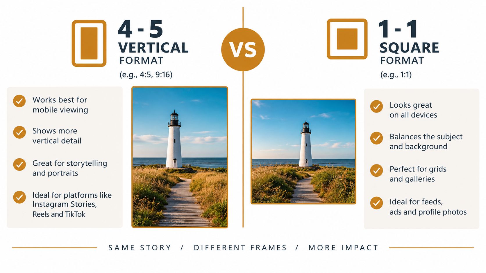
Use 4:5 for Feed prospecting and retargeting when the concept needs more vertical space. Use 1:1 when the asset must work across carousel cards, Marketplace and other square-first placements. The media buying decision is controlled reuse, not one file forced into every inventory type.
At the same width benchmark of 1200 pixels, a 4:5 canvas measures 1200 x 1800, while a square measures 1200 x 1200. The vertical version therefore carries 80% more vertical pixels than the square version. That extra inventory can improve visibility, but only if the composition uses it well.
A taller canvas gives the buyer more room to show a product, demonstrate its use and add supporting context without shrinking the focal subject. It does not guarantee stronger performance. A poorly composed 4:5 ad can lose to a focused square asset, especially when the safe zone pushes the headline or product toward an awkward crop.
Choose the format by inventory
| Campaign situation | Default format | Why |
|---|---|---|
| Feed single-image campaign | 4:5 | More vertical Feed coverage |
| Carousel with product cards | 1:1 | Consistent card geometry |
| Marketplace-led product ads | 1:1 | Product framing is easier to preserve |
| Stories and Reels | 9:16 | Full-screen canvas |
| Mixed placements with no custom assets | 1:1 | Safer reuse, weaker Feed presence |
| Portrait-led direct response concept | 4:5 | More room for subject and hook |
A single master asset is rarely the best production rule. Build one master concept, then export the ratios that protect its hierarchy. A square product cutout may adapt cleanly. A testimonial screenshot, before-and-after layout or price-led composition usually needs a deliberate redesign.
Ratio variation also improves fatigue diagnosis. If the offer remains strong but the crop feels repetitive, create a new composition before changing the headline. That distinction protects testing budget and prevents a placement problem from being mistaken for creative fatigue.
How to map safe zones to prevent automated cropping
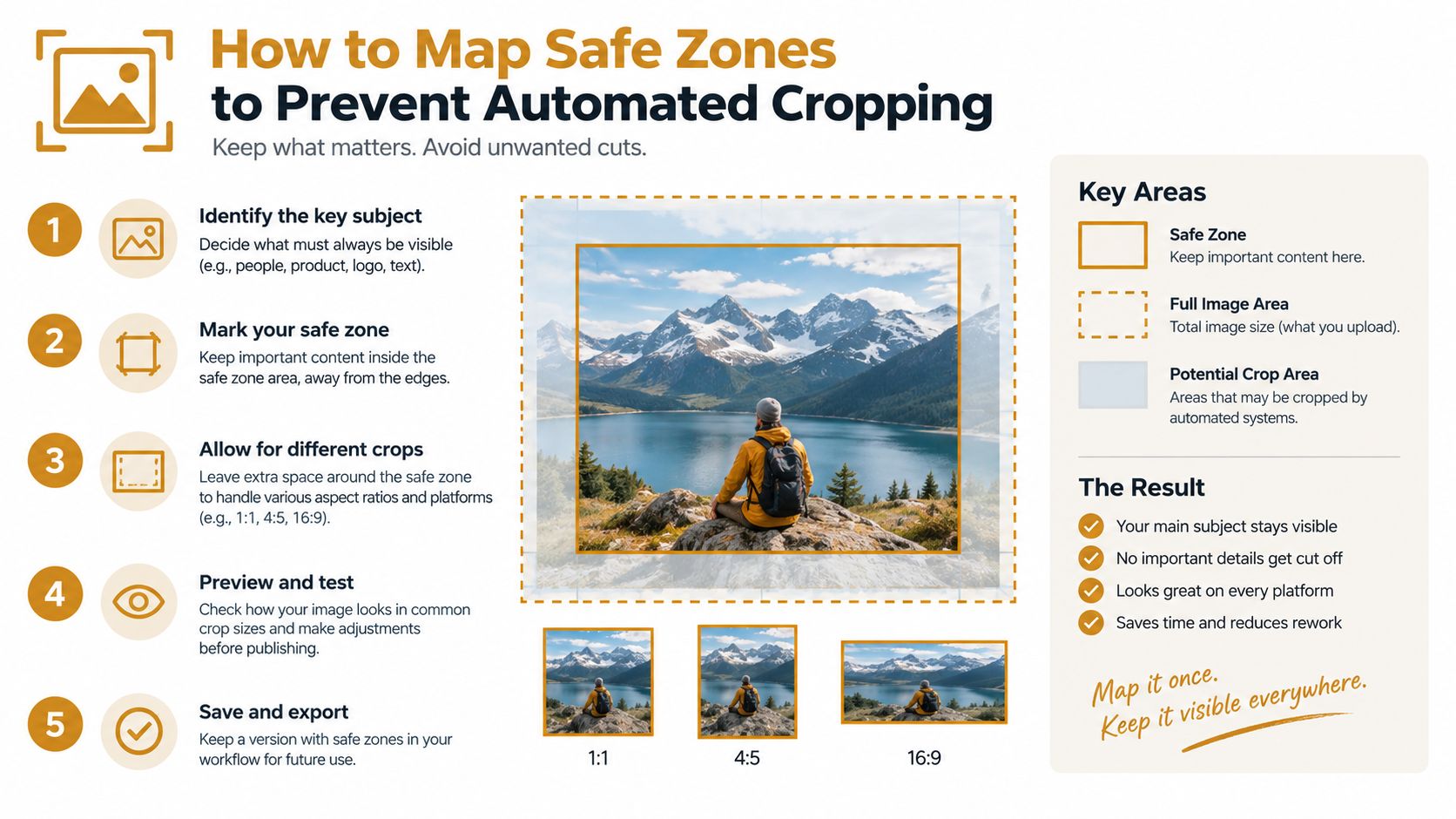
Safe zones are a media buying control, not a final design check. If the hook, offer, logo, or product sits too close to an edge, automated cropping can weaken the ad before the audience sees it. Build protected areas into each template before placing copy or imagery.
Meta’s aspect-ratio tolerance can adjust a file to fit a selected placement. That may produce different crops in Feed, Stories, or Messenger. The upload still qualifies, but the visual hierarchy can change, reducing the space available for the hook or shifting attention away from the offer.
Run the safe-zone checklist
- Lock the canvas first. Create separate artboards for 4:5, 1:1, and 9:16. Do not stretch one frame across placements.
- Keep the hook within the visual centre. Check that the opening line remains readable after interface elements and cropping are applied.
- Protect logos and prices. Keep them away from corners, where small shifts can remove context or reduce recognition.
- Check the focal subject at thumbnail size. If the product disappears when reduced, the composition is spending space without supporting the sale.
- Preview every selected placement. A Feed preview cannot confirm how the same asset will appear in a Story.
- Reject manual exceptions. If a designer must explain why an edge element is safe, move it inward or redesign the frame.
Safe areas vary by interface and placement, so one universal pixel margin cannot cover every device. Use a placement-specific template with a visible guide layer, then inspect a rendered preview at upload. In high-volume production, that extra check prevents a crop issue from being mistaken for weak creative performance.
Which export settings prevent compression artefacts on mobile
Pixel dimensions determine screen output; DPI metadata does not. Export the correct canvas in sRGB, choose a web-ready JPG or PNG, and keep the finished file below the 30 MB limit. The format choice affects more than eligibility. Excessive compression can weaken the hook, blur product details, and reduce trust before the viewer reads the offer.
Use a fixed export recipe
For photographic ads, a high-quality JPG is usually the practical default. It preserves gradients and product detail while keeping file sizes manageable. Use PNG when transparency or sharp, interface-style graphics require it.
Use this checklist:
- Canvas: Export the final placement dimensions, not a screenshot cropped from the design file.
- Colour: Convert to sRGB before saving, so the file uses a standard web colour profile.
- Metadata: Ignore DPI for screen delivery. Confirm the pixel width and height instead.
- Format: Choose JPG for photographic compositions, PNG for transparency or crisp graphic edges.
- Compression: Inspect small type, skin tones, dark gradients, and product edges at mobile size.
- Naming: Include the placement and ratio, such as
prospecting_hookA_feed_4x5.jpg.
Compression artefacts often appear where a desktop review misses them. Muddy shadows, haloed text, and banding can make a correctly sized ad look cheap on a phone. That quality loss can reduce attention before the media buy has a chance to work.
A smaller file is not automatically a better export. Lowering quality to meet a limit may preserve delivery while sacrificing the visual cue that earns the click.
Production test: Review the exported file on a phone before launch, then check the rendered preview in the ad interface. These are separate quality checks.
Use 1080 x 1350 pixels as the 4:5 geometry check. A higher-resolution Feed master can use 1440 x 1800 pixels, provided the ratio remains exact. Exporting the wrong proportion and relying on automated tolerance can shift text, crop the product, or reduce the visible offer. That is a media-buying cost, not merely a design defect.
How to build a scalable template system for high-volume production
A scalable creative system treats aspect ratio as a media-buying decision, not a final design adjustment. Lock the templates before production starts, then make every export pass a rejection gate before Ads Manager. That prevents a hook from shifting, a product from disappearing, or a safe zone from becoming unusable after automated cropping.
Build the file around ratios
Create one source file with separate artboards for:
- 4:5 Feed, using 1440 x 1800 pixels.
- 1:1 square, using 1080 x 1080 pixels as the baseline.
- 9:16 full-screen, using 1080 x 1920 pixels.
- Right column, using 1200 x 1200 pixels where that placement is active.
Lock the ratio, background, and safe-zone guides. Keep the product, proof, and headline as replaceable components. Each variant should show where the creative can tolerate cropping and where text or an offer must remain visible. A junior operator should be able to replace the hook without moving guides or exporting the wrong artboard.
Add a naming and approval gate
Use a version string containing concept, hook, ratio, date, and approval status. The exporter checks dimensions, ratio, colour profile, file size, and rendered preview. The buyer checks placement selection, destination, and tracking before launch.
Keep those responsibilities separate. A second review catches errors that the person who built the asset may stop seeing, while clear naming makes rollback possible when one batch contains a bad crop.
Use replacement maths honestly
Suppose a team needs 12 live concepts, with 3 placement variants per concept:
12 concepts × 3 ratios = 36 files
If 4 files fail preflight:
4 ÷ 36 = 11.1%
That percentage measures production loss, not ad performance. It shows how much planned output disappears before delivery. Track it alongside the creative fatigue production maths, including failed exports as an operational cost rather than counting only spend and frequency.
Retire a format when it repeatedly causes crop or readability failures. A polished master file has no value if its placement version hides the offer. A smaller, reliable template set can produce more usable tests than a larger system that repeatedly requires rework.
Quick answers to common Facebook ad image questions
What image size should I use for Facebook Feed ads?
Use 1440 x 1800 pixels at 4:5 for a single-image Feed ad when vertical space can keep the offer prominent. A 1080 x 1080 pixel square file remains useful for carousel cards and broader cross-placement reuse. The choice affects media delivery, not just the design file. A square asset may preserve more placements, while 4:5 usually gives the Feed creative more room before cropping hides the hook.
What fixes the “image too small” error?
Inspect the exported file’s actual pixel dimensions, not the design application’s artboard label. Meta commonly requires at least 600 pixels of width, and 4:5 Feed assets also need at least 750 pixels of height. Export the placement-sized version from a high-resolution source. Enlarging a small file can pass a visual check while producing soft text and weak product detail after processing.
Can I use a transparent PNG?
PNG works when transparency serves the design, but preview it against the placement background. Transparent edges, pale logos, and fine type can look harsher after upload than they did in the source file. For photographic ads, a flattened sRGB JPG is often easier to predict.
Why did the colours change after upload?
Convert the source to sRGB before export and inspect the saved file, not only the design document. Profile mismatches can shift saturation and contrast, especially in brand colours and dark product photography. Compare the exported file with the uploaded render side by side before approving a batch.
How do I stop carousel cards misaligning?
Use one ratio across every card and export each at identical pixel dimensions. A square carousel system should keep every card at 1080 x 1080 pixels, with the product and copy aligned to shared internal guides. Consistent alignment reduces the chance that one card makes the sequence feel broken or pushes key information into a crop.
For further upload and rendering checks, use the Facebook advertising FAQ. Review live templates against their placement ratio, safe zone, and exported dimensions before producing another batch. Sizing errors can waste a test before the buyer learns whether the creative works. Crank 11 connects placement-specific production with media buying and optimisation. Visit Crank 11 to see the system.