
An ecommerce Facebook ad is a paid Meta creative that presents a product, promise and next action to a selected audience in a chosen placement. The strongest format depends on the buyer’s awareness and the account’s bottleneck, not on whichever ad style is fashionable this week.
Copying a winning image is incomplete. You also need to copy the problem it solves, the proof supporting the promise, the audience stage and the test design. An ecommerce Facebook ad is a paid Meta creative that connects a product promise to a measurable next action.
At Crank11, we score creative against hook, clarity, proof, friction and placement fit before arguing about aesthetics. The gallery below applies that model to 15 formats, with a practical audience, asset structure, scorecard and next hypothesis for each. The thresholds are working hypotheses, not universal benchmarks. Platform behaviour changes, and as of 2026, tracking quality and attribution still affect what the account appears to be doing.
What should a product-focused static ad say?
Lead with the customer’s outcome, not the product’s feature list. A single product image works when the viewer can understand the problem, promised benefit and next action before the scroll moves on.
Take a compact electric food chopper. “Chops onions without the tears” gives the buyer a job to evaluate. “Rechargeable motor, stainless steel blade” gives them specifications to remember, which is less useful in a crowded feed.
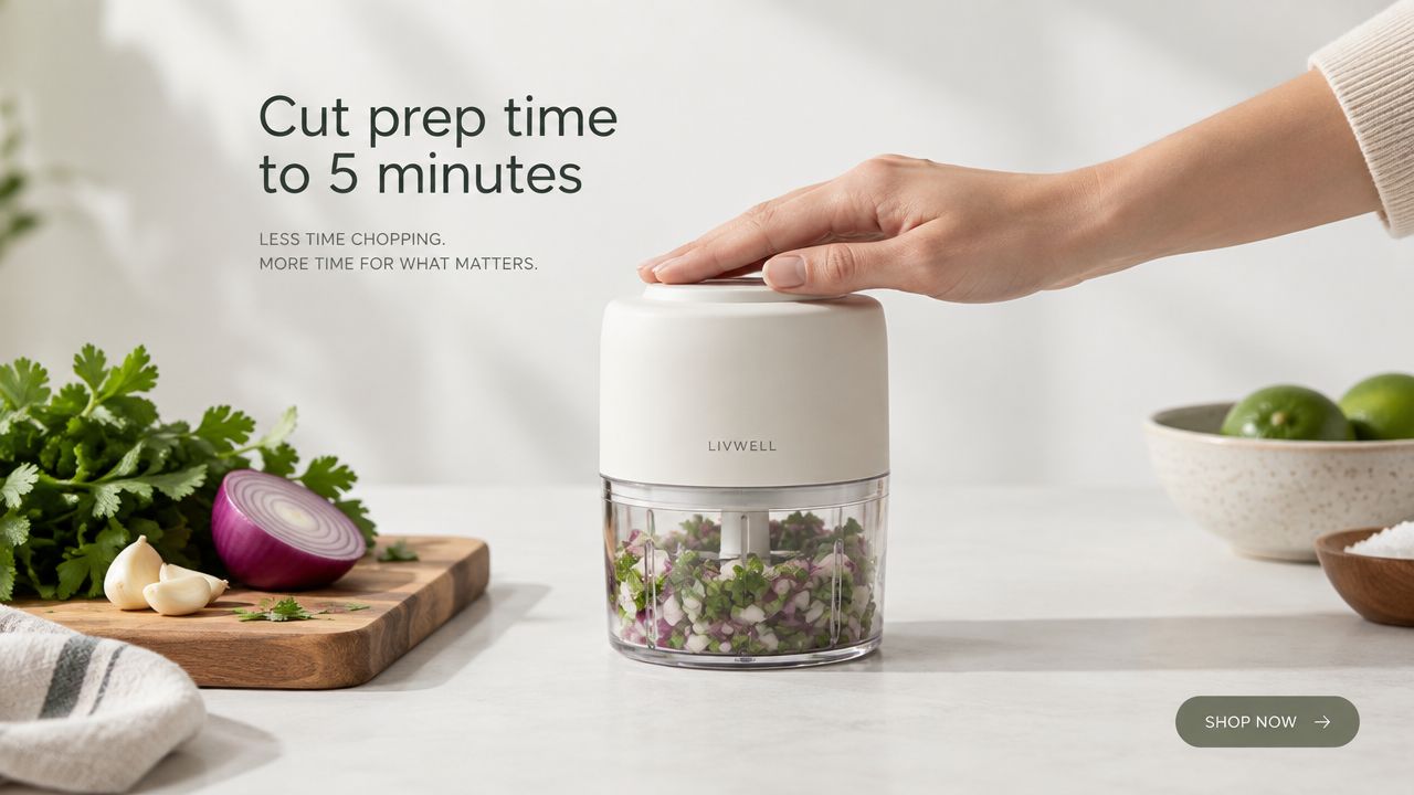
Use a clear asset structure:
- Visual: One product, one context, one obvious action.
- Copy: Problem first, benefit second, proof third.
- Audience: Broad prospecting where the product solves a familiar task.
- Placement: Feed static placements with enough room for readable type.
- Scorecard: Hook clarity, benefit specificity, proof presence, offer friction and placement fit.
- Next test: Run benefit-led copy against feature-led copy while keeping image, audience and landing page unchanged.
For skincare, “clearer-looking skin in 30 days” may earn attention where an ingredient list won’t. For fitness apparel, comfort during a session is more useful than a vague claim about premium fabric. Use customer language from support tickets and reviews, not polished brand phrasing.
Don’t add a number just to make the ad look precise. Use a specific result only when your testing or an applicable study supports it. Static images can stay useful longer than video, but copy fatigue still arrives, so rotate the message before the asset becomes wallpaper.
Which before-and-after carousel structure converts best?
A before-and-after carousel should tell one compact transformation story, then stop. The first card creates recognition, the middle cards supply proof and context, and the final card gives one next action.
A skincare sequence might show the initial concern, product use, later progress and a customer statement. A pressure cooker sequence could contrast stressful preparation with a calmer meal routine. Each card must earn the next swipe.
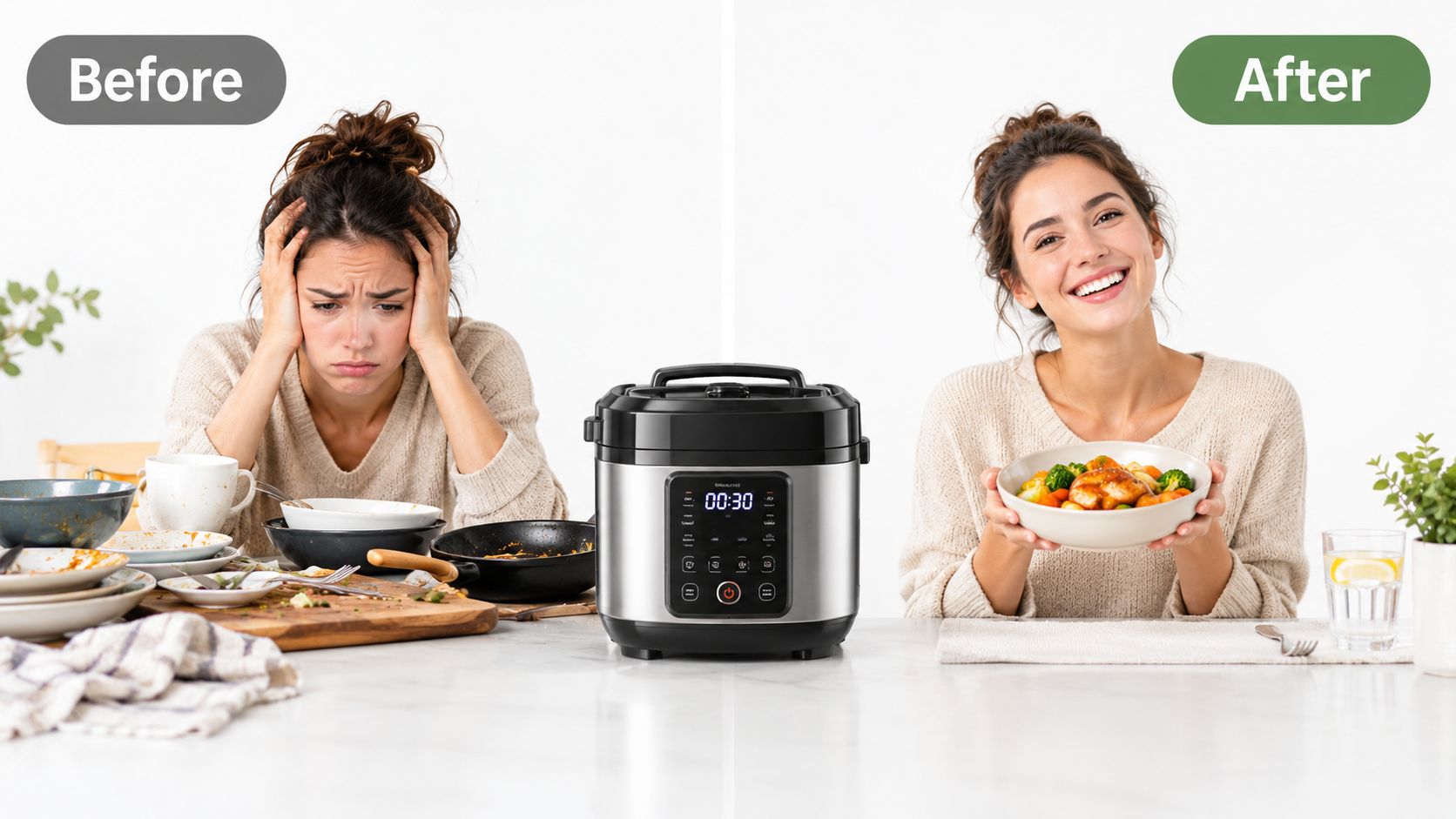
Test sequencing rather than changing everything at once:
- Pain-first: Start with the frustrating state, then reveal the product.
- Result-first: Start with the desired state, then explain the route.
- Proof card: Show a review or usage detail before the CTA.
- Final card: Test “Shop now”, “Shop collection” and “Learn more” as separate variants.
- Drop-off check: If users abandon the sequence heavily by card three, shorten it to three cards.
Keep framing, lighting and product scale consistent. A carousel that looks like five unrelated shoots asks the viewer to rebuild the story on every swipe. Measure card progression, outbound clicks and purchase quality, not just the blended click-through rate.
The audience also changes the sequence. Warm shoppers can tolerate a product-led opening. Cold prospects often need the pain or desired result first, because they haven’t yet decided that your category deserves attention.
How should a video ad hook viewers in the first three seconds?
Open with a direct problem statement in the first three seconds, then show the product solving that problem in the buyer’s real environment. A question often creates work for the viewer. A statement creates recognition.
For a sleep product, “You’re awake at 3am again” is immediately legible. For a pet product, “Your dog eats the same boring kibble” identifies a familiar situation before the product appears. The solution should arrive quickly, not after a brand animation.
Use a short-form asset with this structure:
- Opening: One problem, spoken or shown plainly.
- Middle: Product in use at home, work or the gym.
- Proof: A visible result, demonstration or customer reaction.
- Close: One CTA, not a menu of competing actions.
- Audience: Cold prospects for problem recognition, warm prospects for objection handling.
- Next hypothesis: Hold the footage constant and test five to ten opening statements.
A real kitchen usually beats a studio kitchen for a food product. A real stairwell beats a staged fitness set. The context gives the viewer a reason to believe the scene could happen to them.
Read Crank11’s 2026 approach to AI-assisted ad creative before producing variants at volume. The point isn’t to generate endless edits. It’s to isolate the variable that might change the decision.
Track three-second hold, completed viewing, click quality and post-click conversion. A strong hook with weak purchase rate may be attracting people who identify with the problem but don’t want the product, which is a targeting and promise issue, not automatically a creative win.
Should testimonial videos be polished or unscripted?
Unscripted testimonial videos usually make a better first test for warm audiences than polished brand testimonials. Natural pauses and specific detail provide credibility, but only if the customer explains a concrete experience rather than repeating your headline.
Ask a customer who has owned the product long enough to discuss staying power. Give them one prompt, such as “What specific result did you see?” Don’t hand them a paragraph to memorise.
The asset should contain:
- Speaker: A real customer with relevant product experience.
- Evidence: One concrete outcome, routine change or objection resolved.
- Editing: Minimal cuts that preserve natural delivery.
- Audience: Cart abandoners, engaged visitors or similar-to-buyer audiences.
- Scorecard: Specificity, believability, objection coverage, product visibility and CTA clarity.
- Next test: Compare a routine-focused testimonial with an outcome-focused testimonial.
A supplement customer might describe improved energy or a changed routine. A fitness equipment buyer might show where the product sits in their day. Those details matter more than cinematic lighting.
Don’t assume testimonial footage belongs in cold acquisition by default. A stranger’s claim needs context, and warm traffic already understands the category. Test the asset against a product demonstration for the same retargeting pool, then compare purchase rate and new-customer quality.
When should an urgency countdown ad be used?
Use countdown and limited-stock creative only when the deadline or stock constraint is genuine. False scarcity can produce a short-term order spike and a long-term trust problem.
A seasonal product, legitimate pre-order cutoff or real end-of-sale date gives the message a defensible reason to exist. An expired timer does the opposite. It tells repeat visitors that the brand doesn’t maintain its own claims.
Build the ad around one decision:
- Visual: A clear timer or stock signal that matches the actual offer.
- Copy: State what ends and when.
- Audience: Warm traffic first, especially subscribers and recent visitors.
- Placement: Feed and Stories where the deadline remains legible.
- Scorecard: Offer comprehension, purchase rate, refund behaviour and repeat purchase quality.
- Next hypothesis: Compare urgency against benefit-led retargeting for the same audience.
For a short promotion, cold audiences may need more product education than a timer can provide. Warm audiences already understand the offer, so urgency can remove delay. Keep the message honest and measure the buyers after the sale, not only the first purchase.
Urgency isn’t a substitute for a weak product page. If shoppers still need answers about fit, ingredients, delivery or returns, the timer makes their uncertainty more stressful.
How can a UGC carousel improve audience fit?
A UGC carousel works when several customers show the same solution through different identities and use cases. It isn’t a sequence. It’s a shelf of recognisable evidence.
An apparel brand can show different sizes, ages and body types wearing the same item. A skincare brand can show varied skin tones and routines. A fitness product can show different ability levels using the product without pretending one customer represents everyone.
Source the cards from customers after they’ve had enough time to form an opinion. Give them a simple brief, natural light and permission to speak normally. A product held in an actual home often gives more useful context than a heavily styled shoot.
Use a seven-card working batch as a production hypothesis, not a benchmark. Request more submissions than you need, because many clips won’t show the product clearly or answer the buying objection.
Crank11’s creative production maths for fatigue is useful here. The test is simple. Run the diverse carousel against a visually uniform carousel, then segment results by audience identity and product use case.
Are comparison ads safe for ecommerce brands?
Comparison ads can shorten a buyer’s decision, but every claim must be defensible. Compare against a genuine alternative only where the evidence is clear enough to survive customer scrutiny and platform review.
A reusable bottle can compare materials, durability or ownership experience against disposable alternatives. A new formula can compare documented features against the previous version. A premium supplement can explain a verified difference in composition, but “better” is not evidence.
The asset needs visual proof:
- Comparison: Name the alternative only if the distinction is material.
- Claim: State the exact advantage without inflating it.
- Visual: Use a scale, side-by-side demo or test result where possible.
- Audience: Warm shoppers first.
- Scorecard: Claim comprehension, trust response, click quality and conversion rate.
- Next hypothesis: Test named comparison against a generic alternative comparison.
Don’t use competitor references because the creative looks aggressive. If the advantage is marginal, “our updated formula” or “plastic alternative” may be more credible than a direct callout. If the product cannot win the comparison with clarity, choose a different decision for the ad to make.
What should an educational ecommerce Facebook ad teach?
Teach one useful micro-skill, then show where the product removes effort, risk or time. The lesson earns attention, while the product earns the sale.
A kitchen brand might demonstrate a safer chopping technique before showing its tool. A fitness brand can correct one form mistake, then show how its equipment supports the movement. A sleep brand can explain a wind-down routine, then introduce its product as one practical component.
Keep the lesson short and useful without the product. That constraint matters. If the viewer receives no value until the sales reveal, the ad is just a delayed pitch.
Use captions because many placements are viewed without sound. Pull lesson ideas from support questions, returns and FAQs. Those sources expose real confusion, not the topics the brand wishes buyers cared about.
Score the asset on:
- Teaching value: Can the viewer use the tip immediately?
- Reveal timing: Does the product appear before attention fades?
- Product role: Does it solve a real part of the problem?
- Audience: Cold prospects with an established category pain.
- Next test: Keep the lesson fixed and change the product reveal.
Watch time and saves matter as diagnostic signals, but purchases decide whether the lesson belongs in the acquisition mix. A useful video can still be an expensive distraction if it attracts people who never need the product.
Do price-drop ads work better for warm audiences?
Price-drop ads are usually more useful for warm shoppers than cold prospects. A crossed-out price communicates the offer quickly, but it rarely explains why the product deserves consideration in the first place.
Use the format for a real sale, seasonal clearance or inventory decision. State the reason for the change. “Final season clearance” gives context. A permanent red badge teaches customers to wait.
The asset should make value easy to calculate:
- Old price: Show it only when the comparison is genuine.
- New price: Make the current price dominant.
- Reason: Explain the change without inventing pressure.
- Audience: Cart abandoners, recent product viewers and price-sensitive subscribers.
- Scorecard: Conversion rate, average order value, contribution margin and repeat purchase.
- Next hypothesis: Compare benefit-led copy against price-led copy for the same warm segment.
Don’t test price reduction levels without accounting for margin. A cheaper first order can create a worse business result if it attracts low-retention buyers or trains existing customers to wait for the next promotion.
New subscribers may need product education. Recent cart abandoners may only need the commercial detail that changed. Treat those audiences as different decisions, not one generic retargeting pool.
How much social proof should a static ad contain?
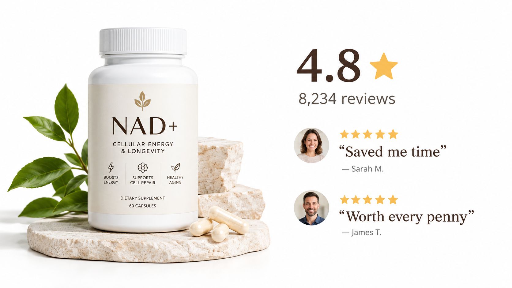
Social proof should answer the buyer’s most likely objection without turning the creative into a review wall. Show a credible rating, useful review volume and two or three short excerpts only when the figures are current and genuine.
A supplement ad might pair a verified rating with comments about routine, taste or tolerance. An apparel ad can use reviews about fit and durability. A beauty product can show what users noticed and how long they used it, provided the claims comply with applicable rules.
The strongest review isn’t always the most enthusiastic. A comment that answers “did it arrive quickly?” or “does it last?” may reduce more friction than another broad statement about loving the product.
Build the creative from a live review source, then refresh it when the underlying evidence changes. Don’t cherry-pick only perfect praise. A balanced, specific review can look more believable than a wall of identical superlatives.
Test social proof against a product demonstration for the same audience. If the proof-heavy version earns clicks but lowers conversion, the creative may be attracting curiosity while leaving the offer or landing page unclear. Fix the decision gap rather than adding more stars.
Which product feature deserves its own video ad?
Give a feature its own short video when the viewer can understand its value by watching it happen. “Watch the product do the thing” is a strong format for physical differences that static images struggle to communicate.
A bottle can show insulation in a real environment. Apparel can show stretch during movement. A gadget can demonstrate setup, closure, durability or charging behaviour. The visual should prove one capability, not tour the entire product.
Shoot the demo under believable conditions. A clean studio may show the object clearly, but a kitchen counter, commute or training session often shows why the feature matters.
Use a small testing matrix:
- Playback: Normal speed versus slow motion.
- Context: Studio versus real use.
- Text: Feature label versus benefit label.
- Edit: Minimal cut versus faster sequence.
- Scorecard: Three-second hold, completion, click quality and purchase rate.
- Next hypothesis: Keep the feature constant while changing the first frame.
Avoid visual ambiguity. Add a restrained text overlay that names the benefit, because viewers won’t always infer the product’s advantage correctly. Quick cuts can create energy, but they can also hide the proof.
Is a limited-edition bundle worth advertising?
A bundle earns its place when the combined offer improves the buying decision and remains profitable after discounting. Scarcity alone is not enough, and a larger basket can still be a poor result if margin or repeat purchase quality collapses.
A skincare starter set can group cleanser, serum and moisturiser around one routine. A fitness bundle can remove the need to assemble equipment separately. A supplement package can serve a clear use period rather than forcing unrelated products into one box.
Show the bundle’s logic:
- Composition: Products belong together for a reason.
- Value: Compare with genuine individual prices.
- Scarcity: Explain why availability is limited.
- Audience: New buyers for first-order value, existing customers for relevant expansion.
- Scorecard: Conversion rate, contribution margin, average order value and later repeat behaviour.
- Next hypothesis: Compare a routine bundle with a lower-priced single-product offer.
Keep bundle economics separate from ordinary product economics. A higher order value can conceal thin margin, more fulfilment complexity or a poor payback period. If the bundle exists only to display a bigger saving, buyers may not understand why they need all the products.
Should an ad lead with the customer’s pain point?
A pain-led ad should name a specific situation before showing the product. This is often stronger than leading with the category because it helps the right buyer recognise themselves before they evaluate the solution.
“Your lower back hurts by 3pm” is more useful than “Meet our posture support.” “You wake up tired after a full night” creates a sharper entry point than “New sleep supplement.” The time, context or identity makes the problem testable.
Use customer language from support tickets, refund reasons and reviews. Then test specificity:
- Broad: A general discomfort or frustration.
- Time-based: The moment the problem appears.
- Identity-based: The buyer’s role or routine.
- Product reveal: Before half the ad has elapsed.
- Scorecard: Hook rate, click-through rate by segment, conversion rate and refund quality.
- Next hypothesis: Narrow the pain statement without changing the offer.
A high click-through rate with weak conversion often means the pain attracts people who don’t fit the product or price. That isn’t a reason to celebrate the hook blindly. Diagnose the whole path with Crank11’s guide to auditing your own ad account.
How should a results-focused ad present customer outcomes?
A results-focused ad needs a real customer, a measurable starting point, a measurable outcome and a clear timeframe. Without those elements, a large number is decoration.
A productivity product might show time saved in a routine. A fitness programme may show a before and after performance measure. A weight-related claim needs particular care, substantiation and context. Do not turn one customer’s result into a promise for everyone.
The asset structure is straightforward:
- Baseline: What was true before using the product?
- Change: What changed, and how was it measured?
- Timeframe: How long did the customer use it?
- Context: What else matters for interpreting the result?
- Audience: Buyers who already understand the category and need proof.
- Next hypothesis: Test a modest outcome against a larger outcome for the same audience.
Ask customers for evidence, not just enthusiasm. The most credible case study may involve a small operational improvement that fits the product’s normal use. The biggest result can create disbelief if the ad doesn’t explain the conditions.
Crank11’s accountability lessons from firing an agency apply here. A result should be traceable to a source, a timeframe and a defined action, not merely repeated because it sounds persuasive.
How do dynamic product-feed retargeting ads work?
Dynamic feed ads should show the shopper the most relevant product, price and next action, with accurate catalog data behind every impression. Their strength is relevance. Their weakness is that a broken feed can personalise the wrong experience at scale.
A retailer can show the exact item viewed, a complementary accessory or a cart product. Segment by recency so a visitor from yesterday receives a different message from someone who browsed weeks ago. Don’t use the same urgency for both.
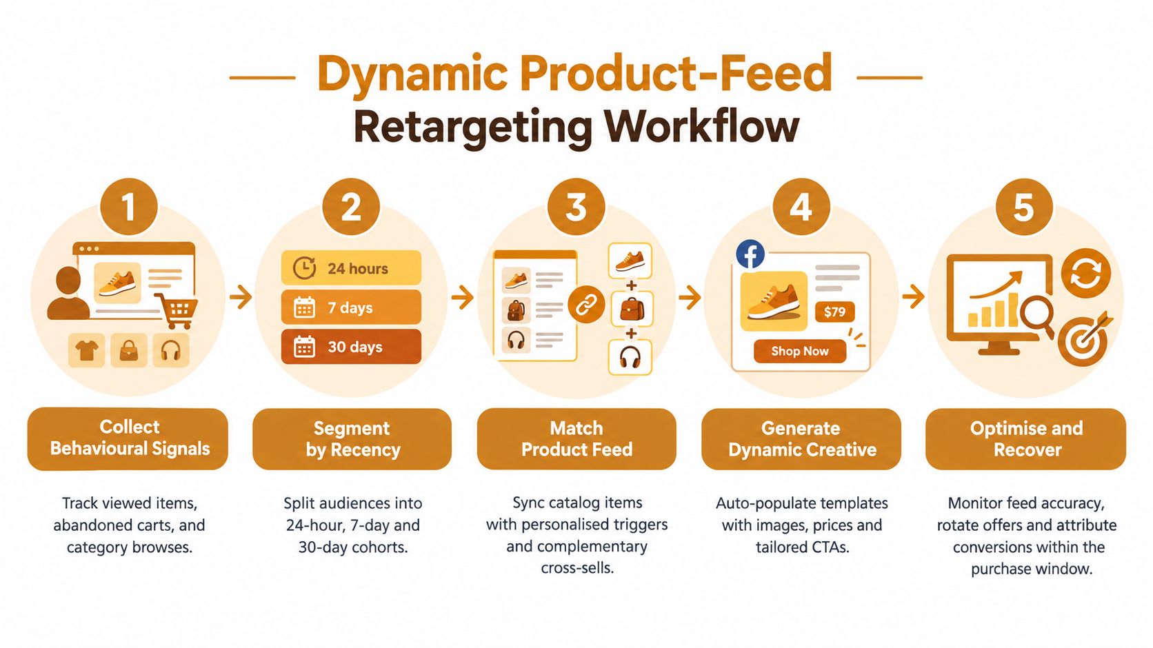
Check the operating details:
- Feed accuracy: Verify images, prices, availability and descriptions regularly.
- Fallback asset: Use a clean default when a product field is missing.
- Recency: Separate recent viewers, older visitors and cart users.
- Offer: Use short-lived personalised offers only where margin allows.
- Scorecard: View-to-purchase latency, purchase rate, margin and repeat behaviour.
- Next hypothesis: Compare product reminder creative against complementary cross-sell creative.
Crank11’s Meta Ads engine follows the same operational principle. Automation should reduce repetitive production, not remove review. Check the feed, exclusions, attribution and landing page before trusting a personalised result.
15 Ecommerce Facebook Ad Formats Compared
| Ad format | Implementation complexity | Resource requirements | Expected outcomes | Ideal use cases | Key advantages |
|---|---|---|---|---|---|
| Product-focused static ads with benefit-driven copy | Low, easy to produce and iterate | Minimal (single hero image, copy variants) | Clear benefit messaging; good CTR/CPC on cold traffic when optimized | Single-product ecommerce; cold audiences | Low production cost; fast copy A/B tests |
| Before-and-after carousel ads with transformation focus | Medium, requires sequencing and narrative | Multiple cards with consistent visuals and sequencing | Higher engagement and completion; warmer leads from swipers | Transformational products (weight loss, skincare, SaaS demos) | Storytelling across cards; multi-prop testing |
| Video ads with problem statement hook in first 3 seconds | High, scripting, filming, editing | Video production, captions, vertical/square formats | Lower CPC; higher VTR; stops scroll quickly | Products needing demonstration; cold traffic acquisition | Strong immediate hook; shows complex benefits |
| Testimonial video ads with unscripted delivery | Medium, recruit and coordinate customers | Customer sourcing, mobile shoots, vetting takes | High engagement and authenticity on warm audiences | Retargeting, social proof campaigns | Authentic peer recommendation; higher engagement |
| Urgency-based countdown timer ads with limited-stock signal | Medium, timer integration and frequent refresh | Timer assets, offer management, timely creative updates | Short-term increase in CVR; risk of fatigue if overused | Flash sales, limited-stock promotions, cart abandoners | Drives fast decisions via scarcity and time pressure |
| User-generated content carousel with diverse customer angles | Medium-High, sourcing and rights clearance | Customer photos/videos, consent/legal clearance, curation | Lower CPM; higher CTR via identity matching | Brands valuing authenticity and demographic reach | Diverse representation; natural, lower-cost creative |
| Comparison ads showing product against competitor or alternative | Medium, requires defensible claims and legal review | Test data, side-by-side creative, legal sign-off | Higher CVR if claims are credible; legal/platform risk exists | Competitive categories, product upgrades, sustainability claims | Narrows decision set; strong positioning vs alternatives |
| Educational hook ads teaching a micro-skill related to product | High, research, scripting, tutorial design | Subject-matter expertise, video production, captions | Longer watch-time; higher shares; authority building | Complex categories; awareness and content marketing | Shareable content; positions brand as helpful expert |
| Price-drop or price-comparison ads highlighting value shift | Low, simple graphic updates | Price assets and frequent updates | Higher CVR among price-sensitive and warm audiences | Clearance, flash sales, retargeting | Immediate clarity; fast to deploy; high conversion |
| Social proof ads with review scores and testimonial density | Low-Medium, design to surface reviews | Review aggregation, design layout, sufficient review volume | Lower CPC and higher CVR on cold traffic | First-time buyers; category-uncertain audiences | Peer credibility; quick trust-building |
| Feature-focused ads showing product functionality in motion | Medium, short demo videos or GIFs | Product footage or animation, editing, pacing tests | Lower CPC; communicates functionality quickly | Tangible products with distinct features | Demonstrates capability; stops scroll with motion |
| Bundle or limited-edition ads combining scarcity with discount | Medium, bundle design and inventory coordination | Visuals of multiple SKUs, pricing setup, inventory tracking | Higher AOV; can increase conversions if bundle is compelling | New-customer AOV lift, seasonal offers, upsells | Increases AOV; combines value plus scarcity |
| Problem-focused ads leading with customer pain point, not product | Low-Medium, requires precise messaging | Copy informed by support/reviews, targeted creatives | Higher CTR on cold audiences; rapid qualification | Broad targeting where pain is common | Validates pain first; reduces ad-skip rate |
| Case study or results-focused ads with measurable customer outcome | Medium, data collection and compliance review | Customer metrics, documentation, visual assets | Higher CVR using specific measurable proof | High-consideration or B2B purchases; retargeting | Specific numbers increase credibility and trust |
| Dynamic product-feed retargeting ads with personalised creative | High, feed integration and template setup | Reliable product feed, engineering, dynamic templates | Higher CVR for retargeting; scalable personalization | Large catalogs, abandoned cart recovery, cross-sell | Personal relevance at scale; automated creative updates |
How do you turn these ad formats into a testing queue?
Choose the format by the bottleneck, then change one meaningful variable. If the account has weak attention, test the hook. If it has clicks but poor purchase rate, test proof, offer clarity or post-click continuity. If warm traffic is exhausted, change the audience’s decision rather than adding a new colour treatment.
Central position: The best ecommerce Facebook ad is the one that resolves the account’s current decision gap, not the format with the best reputation.
A practical queue starts with five questions:
- What does the buyer already know? Use pain-led or educational creative for category recognition, then proof-led or comparison creative for considered shoppers.
- What is the account failing to explain? Use demonstrations for functionality, testimonials for experience and price creative for a genuine commercial change.
- Where is the friction? Review landing page continuity, checkout behaviour and tracking before blaming the ad.
- Which placement is carrying delivery? Score the asset where it appears. A readable feed static may fail in Stories, while a vertical demo may work across both.
- What is the next hypothesis? Write one sentence before launch, such as “A benefit-led opening will improve qualified clicks because the current ad leads with a feature.”
The supplied funnel benchmarks offer a useful diagnostic frame. The benchmark set reports landing page view to content view at roughly 1.5x, while content view to add-to-cart, add-to-cart to checkout initiated and checkout initiated to purchase each sit around 10% to 20% in the cited source, TribeUp Academy’s Meta Ads benchmark guide. Treat these as working hypotheses, not universal targets.
If landing page views don’t become content views, inspect speed, redirects and message continuity. If product views don’t become carts, inspect price, proof, fit and offer clarity. If carts don’t become purchases, inspect delivery, payment, returns and checkout friction. A weak blended ROAS doesn’t tell you which of those failed.
Tracking deserves equal attention. Meta’s Conversions API sends events from the server and can bypass browser restrictions and ad blockers, while one independent explainer says pixel-only setups may miss 30% to 60% of conversions for privacy-conscious audiences, Marketer’s Pixel and CAPI explanation. The same source reports Event Match Quality rising from below 6 to between 8 and 10 for advertisers using Pixel and CAPI together. These are measurement facts, not reasons to inflate performance claims.
Frequency needs audience context. A recent benchmark summary cites a cross-industry median frequency of 3.01, while practitioner guidance keeps prospecting below 2 exposures per week and retargeting between 3 and 8 exposures per week, Superscale’s Meta frequency guidance. Use those as rotation prompts, not automatic kill rules. A high-intent retargeting audience can tolerate more exposure than a cold prospecting pool.
The same caution applies to ROAS. One 2026 ecommerce benchmark reports a median ROAS of 1.86x, median conversion rate of 1.60%, median CPM of $15.06 and median CTR of 2.39%, with a warning that iOS privacy loss can hide 20% to 30% of conversions from platform reporting, Just Digital’s ecommerce benchmark. Another benchmark compilation reports ecommerce CTR at 2.39% from Triple Whale and 1.75% from a separate benchmark page, Fibbler’s ecommerce benchmark compilation. The spread is a reminder to compare like with like.
A second 2026 benchmark set reports median ecommerce ROAS of 3.4x, with top-quartile accounts at 5.2x and the top 10% at 7.1x, alongside median CPM of $16.80, CPC of $0.87, CTR of 1.93%, CVR of 2.7% and CPA of $32.22, Webtonic’s ecommerce Facebook Ads statistics. The difference between benchmark sets is substantial. Use your own contribution margin and blended acquisition numbers as the operating truth.
Here’s the maths for a static-ad guardrail. Suppose AOV is £80, and you reserve 15% of AOV as the maximum first-click acquisition allowance for an early test. £80 × 0.15 = £12, so the working CPC ceiling is £12 per click for that test period.
That does not mean £12 is a sensible account-wide target. It means a named input, currency, time period and rule produce a decision boundary. If conversion rate, margin, repeat purchase and attribution change, the ceiling changes too.
Use this compact queue tomorrow:
- Weak attention: Test problem statement versus benefit statement.
- Weak trust: Test unscripted testimonial versus social proof static.
- Weak product understanding: Test feature demonstration versus educational hook.
- Weak warm conversion: Test price-drop or genuine urgency creative.
- High fatigue: Rotate the angle, opening frame and customer context, not only the headline.
- Unclear measurement: Check Pixel and CAPI events before judging the next batch.
Crank11 works with scaled ecommerce operators who need creative production, Meta Ads management, CRO and tracking decisions connected rather than handed between vendors. The useful standard is simple: draft, score, ship, measure and retire the ads that no longer answer a meaningful buyer question.
A creative scorecard turns subjective review into a queue: hook, proof, placement, friction and one measurable hypothesis.
[[C11-OPTIN]]
Quick answers
What is the best ecommerce Facebook ad format?
There isn’t one universal winner. Match the format to the decision gap. Use demonstrations for product functionality, testimonials for trust, pain-led ads for recognition, price creative for warm commercial intent and feed ads for personalised reminders.
Should ecommerce ads use video or static images?
Use both when they answer different questions. Video can show a product in motion or lead with a problem. Static creative can communicate a benefit, price or proof block quickly. Judge each by qualified clicks and purchases, not format preference.
How often should Facebook ad creative be refreshed?
Use frequency and declining response as prompts to rotate. Working guidance cited by Superscale keeps prospecting below 2 exposures per week and allows 3 to 8 for retargeting, but audience intent and creative relevance matter more than a fixed calendar.
Why are clicks strong but purchases weak?
The ad may attract the wrong buyer, overpromise, or send traffic to a page that doesn’t continue the same message. Check the funnel by stage, offer clarity, product proof, checkout friction and tracking before changing the entire account.
Should I use Meta Pixel and Conversions API?
For larger accounts, use both where your implementation supports it. Pixel captures browser events, while CAPI sends server-side events and can improve event matching when configured correctly. Validate event quality rather than assuming implementation equals accurate reporting.
Score tomorrow’s next batch against hook, proof, placement and one measurable hypothesis, then use the creative testing playbook to keep the queue moving.
Crank11 provides senior-led Meta Ads management, creative production, CRO and tracking reviews for ecommerce brands already investing heavily in paid acquisition. Visit Crank11 to see how the operating model connects ad concepts with production, measurement and post-click testing.