
Good ads image assets don’t scale because they look polished. They scale because the team treats each visual as a measurable performance instrument, tests a clear hypothesis, and retires weak concepts quickly. The winning workflow combines platform-safe specifications, strong hierarchy, rapid production, and disciplined scoring, not another round of subjective design reviews.
The popular answer is “make better creative”. That’s incomplete. Better means more likely to earn attention, communicate value, survive placement constraints, and keep acquisition economics healthy.
An ads image is a paid visual asset that earns distribution by making a message easier to notice, understand, and act on.
Why most ads image concepts fail before they scale
Most image concepts fail within weeks, even when the design looks perfectly competent. That isn’t a designer problem. It’s the natural shape of a winner-take-most system.
Motion Creative Benchmarks 2026 reports that only about 5% of creatives become winners, with winners defined as ads reaching at least 10× an account’s median spend and at least $500 in spend. A separate 2026 Meta-focused summary found that only 4% to 8% of launched ads become winners, while about half are turned off before 28 days of spend.
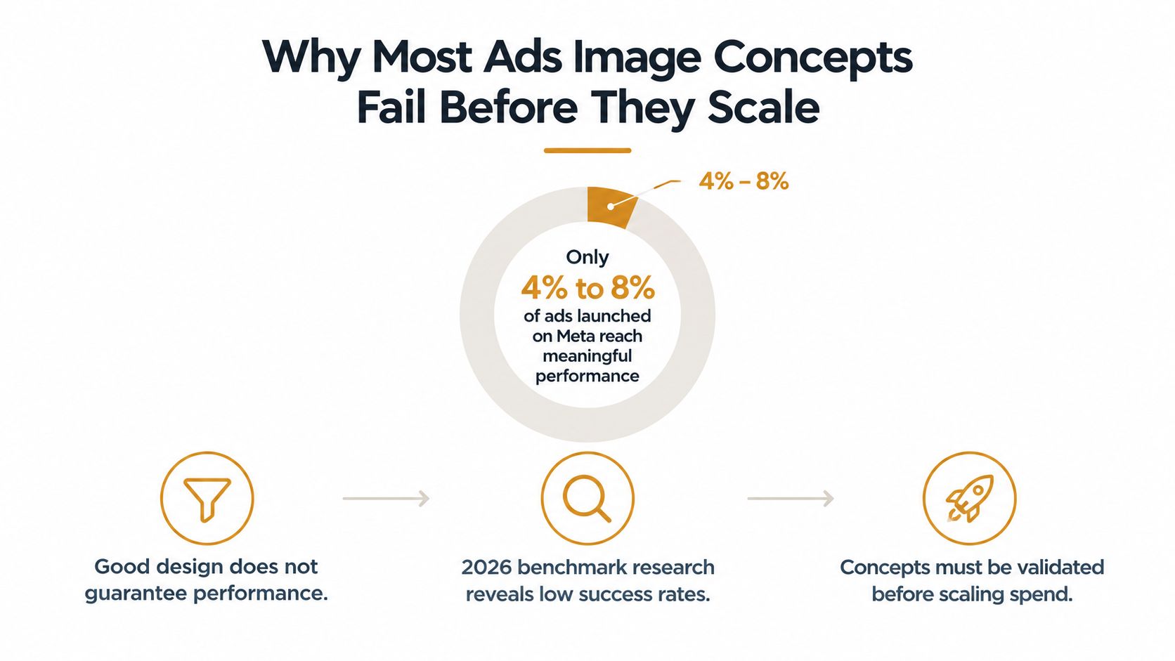
The same benchmark source analyses 48.5 million Meta impressions and reports that 80% of creatives never reached 100,000 lifetime impressions, while 89% never reached 250,000. The median creative ran for only 18 days and generated 10,665 lifetime impressions. In practical terms, the average concept has a short window to prove it deserves more budget.
Design quality is only the entry ticket
A beautifully composed lifestyle photograph can still bury the offer. A technically correct product cutout can still look like every other advert in the feed. The visual has to do a commercial job before it gets rewarded with meaningful delivery.
That changes the production brief. Don’t ask, “Does this look on-brand?” Ask, “What must this image make a cold prospect understand before they scroll?” Brand consistency matters, but it can’t excuse weak communication.
Production rule: Treat every concept as a hypothesis with a scoring method, not as a finished artwork awaiting approval.
We build around a portfolio of distinct ideas, not tiny variations of one safe layout. One concept may lead with the product, another with the customer’s problem, another with the outcome, and another with proof. The point is to increase the number of credible bets entering validation.
If your account is tired, read our analysis of why paid social ads fatigue. The useful diagnosis usually starts with production volume, message repetition, and slow retirement, not with a fresh audience theory.
How to prepare briefs and assets that meet platform specs
A good brief removes ambiguity before design starts. It names one audience tension, one promise, one proof point, and the placement the asset must survive.
Many teams hand designers a product page and a vague instruction to “make something premium”. That produces attractive leftovers from the website, not platform-native creative. A performance brief should state the commercial job in one sentence, then list what the viewer must notice first.
Build the asset architecture first
Google Ads specifies that Performance Max image assets must use JPG or PNG, stay below a 5 MB maximum file size, and keep important content in the centre 80% of the frame to reduce cropping across devices. The Google Ads Performance Max image asset requirements should be treated as production constraints, not a final upload check.
For the horizontal format, Google recommends 1.91:1 at 1200 × 628 pixels, with a minimum of 600 × 314 pixels. For square assets, the recommendation is 1:1 at 1200 × 1200 pixels, with a minimum of 300 × 300 pixels, as set out in the Google Ads image policy specifications.
Design the master at the recommended dimensions. Keep the background, product, typography, logo, overlays, and retouching on separate layers. Export placement variants from that source rather than resizing a flattened file and discovering that the headline now sits under an interface element.
A sensible hierarchy looks like this:
- Message layer: one proposition, written for the intended audience.
- Subject layer: the product, person, problem, or outcome that carries attention.
- Proof layer: a visual or short factual cue that supports the promise.
- Brand layer: enough identity to build recognition without stealing the frame.
- Export layer: named files by platform, ratio, placement, and revision.
Use the Crank11 creative brief to force those decisions before a designer opens a canvas. The brief should also record the control asset, the test variable, the destination page, and the acquisition metric that decides whether the concept earns another batch.
A source file should make the next variant cheap. If changing one claim requires rebuilding the whole image, the system is already too fragile.
Visual hierarchy and copy overlays that survive the feed
The image must communicate its commercial point before decoration gets noticed. A strong composition gives the eye a route, product or outcome first, short supporting copy second, and action cue third.
A DTC founder can spend heavily on crisp lifestyle photography and still get poor results because the product benefit is hidden behind atmosphere. The image feels considered in a brand review. In the feed, it feels slow.
Use a three-level visual funnel
Research cited from a Magna and Yahoo study found that creative quality accounted for 56% of purchase intent. Improved visuals increased aided ad recall by 23% and noticeability among in-market consumers by 20%. The same study reported that desktop imagery improved search intent by 23% and message association by 50%.
Those figures don’t mean attractive images automatically sell. They support a stricter position: visual quality matters because it improves the chance that the message gets noticed and associated with the offer.
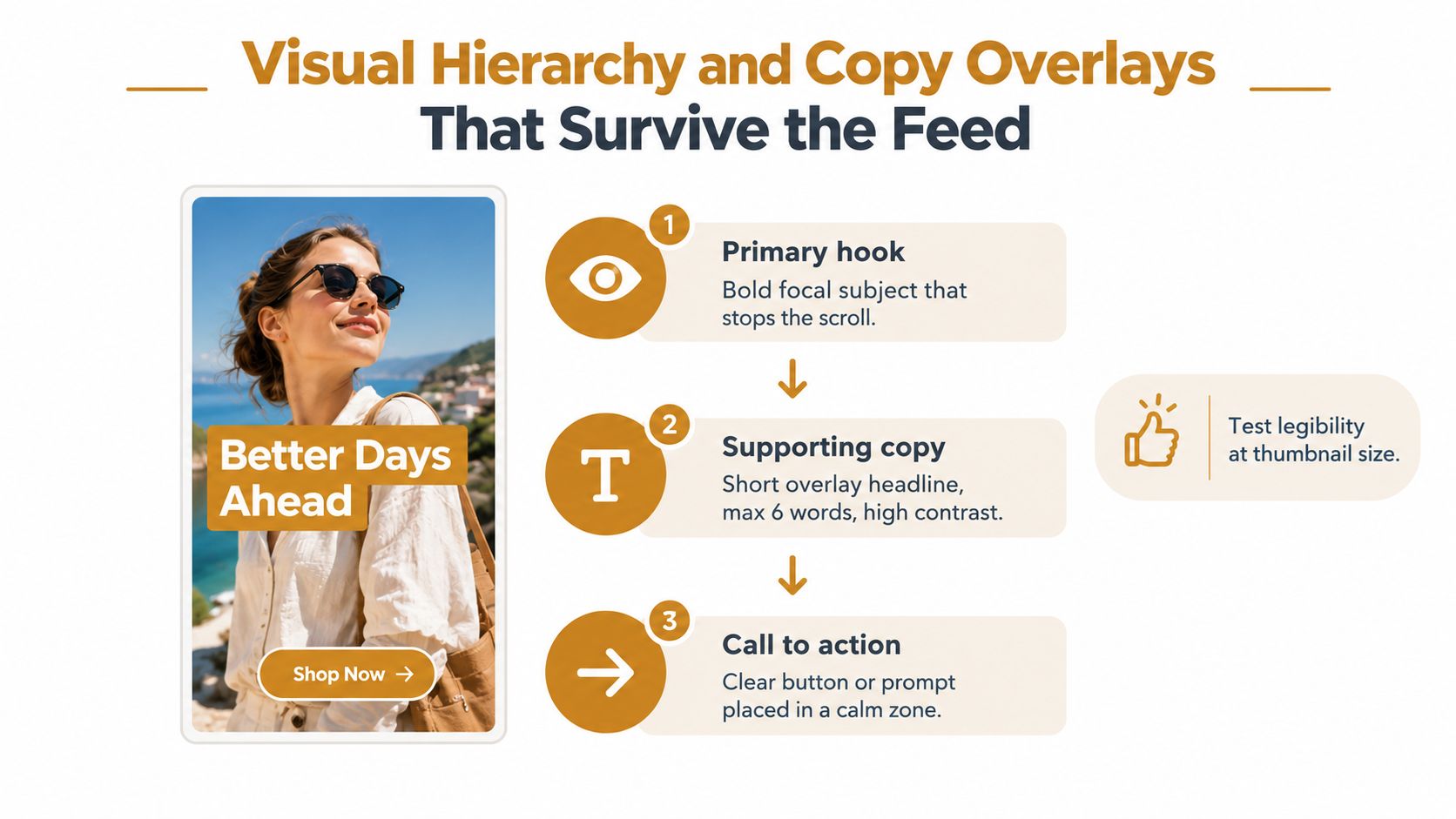
Use this approval checklist:
- Primary hook: Can the viewer identify the focal subject at thumbnail size?
- Value proposition: Is there one headline, not a paragraph disguised as a graphic?
- Contrast: Does the copy remain readable after compression and on a small screen?
- Outcome: Does the image show what changes for the buyer, not just what the product looks like?
- Calm zone: Is the action cue placed where platform controls won’t compete with it?
- Brand cue: Can someone recognise the brand without the logo dominating the frame?
Short overlays usually survive better than clever ones. A headline of six words maximum is a useful internal constraint, not a platform rule. Remove qualifiers, stacked benefits, and the urge to explain the whole funnel inside one square.
A visual can be minimal and still be clear. It can also be busy and still be legible, provided the elements have a deliberate order. Review every asset at full size and thumbnail size. The second view is the one that exposes the expensive mistakes.
Read the stale creative teardown before approving another batch of attractive images that says nothing quickly.
[[C11-OPTIN]]
Download the static creative scoring sheet that ranks hook clarity, hierarchy, proof, and placement safety before launch.
AI-assisted production and the speed advantage
AI earns its place in ad production by increasing the number of viable concepts operators can examine. It cannot supply the commercial angle, resolve an unclear brief, or replace quality control.
Recent 2026 industry data reported a resurgence of static image ads on Facebook and Instagram after years of video dominance (AI-assisted ad creative analysis). Separately, the Advertising Research Foundation creative quality report found that higher-scoring creatives delivered 15% cheaper CPMs than bottom-third creatives.
The operating constraint is straightforward: production speed only matters when quality stays visible in the process. More outputs can create more waste if nobody scores the ideas, checks the details, or connects each variant to a commercial objective. The workflow should shorten the path from concept to export, launch, and revision while preserving judgment.
Compare the two production modes
| Production mode | Strength | Failure mode | Best use |
|---|---|---|---|
| Manual production | Strong judgement and controlled retouching | Slow iteration and expensive minor changes | Flagship concepts and final polish |
| AI-assisted production | Fast variation across backgrounds, compositions, and scenes | Repetitive output, factual errors, weak brand fit | Concept volume and controlled exploration |
| Hybrid workflow | Human direction with machine-assisted variation | Requires a scoring owner | Ongoing performance production |
AI generates options around a defined idea; senior operators decide which options deserve spend. They correct product details, remove visual noise, check claims, and compare every variant with the brief. The machine supplies more starting points. People protect the probability that one reaches the rare top performance tier.
Crank11 operates around a one-day creative turnaround and a two-hour response time, with senior operators reviewing the work. Speed matters because creative fatigue continues during approval delays. A fast workflow without a scorecard produces mediocre exports sooner.

Use AI for background exploration, scene variation, format adaptation, and early concept volume. Keep human control over product accuracy, offer wording, brand rules, legal review, and final selection. A generated image that misrepresents the product creates avoidable liability.
The AI ad creative workflow works best when every output enters the same scoring and launch process as a manually produced asset. That discipline turns speed into a performance advantage instead of a larger archive of attractive images.
Testing workflows and iteration cadence tied to acquisition goals
Testing copy alone won’t solve visual fatigue. A campaign can keep the same audience and offer while the image loses attention, pushes up CPA, and weakens MER.
Google Ads reports an average 6% increase in click-through rate when image assets appear with Search ads, as documented in its image assets guidance. Google also lets advertisers review image and video performance in campaign statistics tables on the Ads and Dimensions tabs, including image performance in the Ads tab and free-click interactions in Dimensions.
Run a scoring loop, not random A/B tests
Start each batch with a control and a clear visual variable. Hold audience, placement, landing page, and offer constant where possible. Change one meaningful dimension per batch, such as subject, colour balance, composition, proof treatment, or headline angle.
Large-scale display research measured creative attributes across RightMedia and linked visual appearance to user response in this published study on computational advertising. Its practical implication is useful: test visual features systematically instead of relying on raw click totals or internal taste.
A workable loop looks like this:
- Brief: State the audience tension, promise, proof, and destination.
- Batch: Produce distinct concepts, then create controlled variants.
- Score: Rate hook clarity, hierarchy, relevance, proof, brand fit, and placement safety.
- Launch: Start with a defined control and track the first meaningful signals.
- Read: Separate attention metrics from acquisition metrics. Check CTR, hook behaviour, CPA, ROAS, MER, and conversion quality.
- Retire: Remove weak concepts instead of allowing them to absorb budget by default.
- Iterate: Build the next batch from winning angles and unresolved objections.
The Motion benchmark’s 18-day median creative run is a useful fatigue reference, not a universal retirement rule. If an asset has run longer than that benchmark while impression velocity rises and downstream efficiency falls, treat it as suspect and prepare its replacement before performance collapses. Cite the benchmark context in the creative fatigue production maths guide.
Show the maths
Assume a campaign spends £30,000 in one month and generates £120,000 in attributed revenue.
Inputs: £30,000 monthly spend, £120,000 attributed revenue.
Calculation: £120,000 ÷ £30,000 = 4.0 ROAS.
Meaning: Each pound of tracked media spend produces four pounds of attributed revenue, before considering margin, returns, overhead, and incrementality.
If image assets produce a 6% CTR increase in a Search campaign, that can improve the flow of qualified visitors, but it doesn’t prove profitable growth by itself. The decision still belongs to CPA, contribution margin, conversion quality, and MER.
If you’re not retiring losers quickly, you’re funding them. At Crank11, senior operators sign off every output. Junior staffing isn’t an option when margin depends on creative quality.
[[C11-OPTIN]]
Get the acquisition creative playbook for connecting asset scores to CTR, CPA, ROAS, MER, and fatigue decisions.
Tomorrow morning, audit your current batch, identify the weakest visual hypothesis, and brief its replacement before delivery falls further. Use the Crank11 playbook to build a repeatable system for producing, scoring, and rotating performance creative.
Quick answers
What makes an ads image perform well?
A clear focal subject, one relevant promise, readable hierarchy, strong placement fit, and a measurable reason for testing. Attractive design helps, but it doesn’t replace commercial clarity.
Should image ads include text overlays?
Yes, when the overlay makes the offer easier to understand quickly. Keep it short, high contrast, and away from likely interface crops. Don’t turn the image into a landing page.
Are static image ads still worth testing in 2026?
Yes. 2026 industry data reported a resurgence of static image ads on Facebook and Instagram, while creative quality research linked stronger creative scores with cheaper CPMs.
How often should image ads be refreshed?
Use performance and fatigue signals rather than a fixed calendar. The 2026 benchmark reported a median creative run of 18 days, so assets approaching or exceeding that period deserve an active review.
What should AI do in the workflow?
AI should create controlled variations and speed up production. Senior operators should set the angle, check accuracy, score outputs, and decide which concepts receive spend.
Crank11 builds and scores static creatives for paid acquisition, with senior operators handling strategy and sign-off, rapid production cycles, and placement-ready outputs. Visit Crank 11 to see how the system fits brands already spending seriously on paid traffic.